Letterhead collector Brian W writes,
An integral and important part of every commercial company’s ‘livery’, a letterhead was designed to convey most facets of the business venture. As part of the company’s ‘livery’ the letterhead usually matches the format and style of printwork, packaging, vehicles and uniforms etc. Usually discarded some seven years after introduction, older letterheads crop up from time to time from storage areas, and such
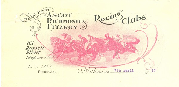
We start with a favourite of Brian’s. The memo is from an old race course near Brian’s home and refers to the opinion of the secretary, Mr Wren (John Wren of course). These clubs were for ponies, not racehorses, and so catered for the punters on a lower income.
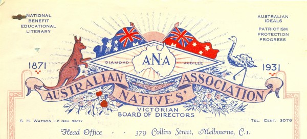
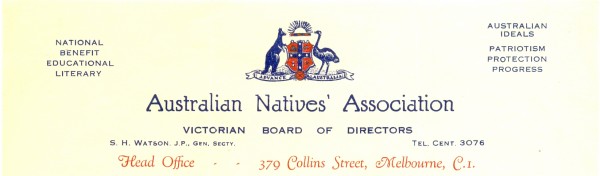
Patriotic – Australian Natives Association
The next example is of a more formal design with map of Australia, flags, native animals and flowers marking the 60th anniversary of the Australian Natives Association. The next extracted letterhead from later the same decade is more subdued.
Conveying most facets of the business venture
Brian noted that the letterhead was ‘designed to convey most facets of the business venture’. The next examples illustrate this point.
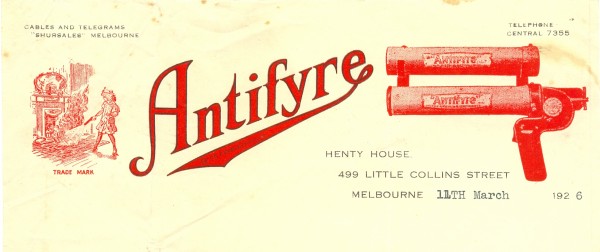
Fyre, fyre! On the right of this letterhead is the Antifyre pistol (this is between the wars) – demonstrations can be arranged at a ‘time convenient to yourself’. Little girl on the left demonstrates the pistol in a domestic setting. Note the contact point “Shursales”.
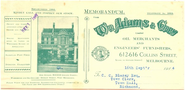
In contrast this very busy letterhead shows the reader the substantial premises, product list and contact details in multiple fonts – it looks like a product that has grown like ‘Topsy’.
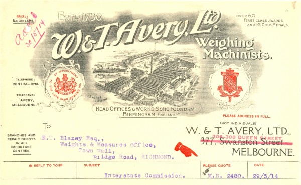
Here is another busy letterhead with a change of address simply stamped over the old address. This practical solution would not be welcomed by printers or paper suppliers. This shows the substantial head works; the Royal appointment; the number of awards and medals.
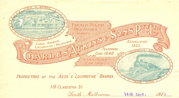
This is somewhat intriguing- producers of polish, varnishes and other surface covers. Once again we are shown the substantial works. But why the locomotive?
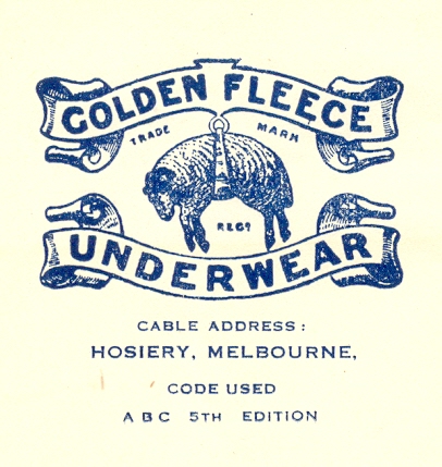
Memorable images
Some letterheads include simple but memorable images – we have ‘cut’ some out to show you the fine detail. (Pardon the odd shape of the last item.)